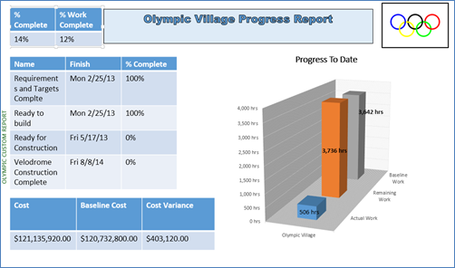
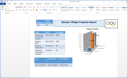
I recently presented a webinar demonstration of the new reporting feature in Microsoft Project 2013 for MPUG. As a follow up to the presentation, I am going to demonstrate how I created the custom dashboard seen in the webinar. Below is an example of a dashboard that I created. As you can see, it has some branding and the various elements are organized to it look more appealing. Creating a dashboard is much easier than you would think, in fact this is the first dashboard that I have created in Project 2013 and it only took me about 30 minutes to get everything the way I wanted.
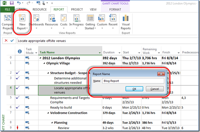
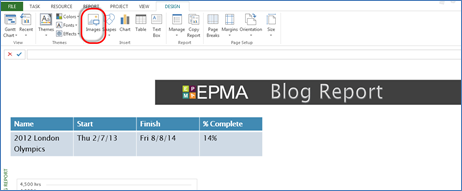
To create a new report or dashboard you go the ‘Report’ ribbon then select ‘New Report’. After choosing ‘New Report’, you will be prompted to give the report a Name.
Once you have named the report and clicked ‘Ok’, you will see a blank report. I want to insert a Table into my report so I can easily view the Project Name, Start Date, Finish Date, and Percentage Complete. In order to do this, you go to the ‘Design’ ribbon and click on the ‘Table’ button. A table will be inserted.
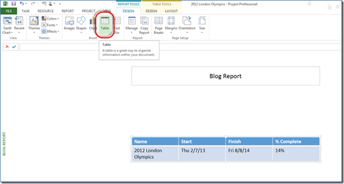
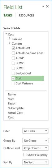
Once the table is inserted you can then use the ‘Field List’ dialogue box on the right hand side to choose what information you want to display in your table. The values are broken down into Cost, Date, Work, etc. which makes if very easy to find the data you are looking for quickly. You can also select a filter, grouping, sorting, etc. depending on what sort of data you would like within your table. You can see in this example I have selected Actual Cost and Cost and removed the other fields. I then resized the table and moved it up to the top left corner (Columns are adjusted just like Excel and to move it just click and drag).
I am now going to add a chart to my report; we do this in the same way as adding a table. You start out by clicking on the ‘Design’ ribbon, then click ‘Chart’. There are various charts to choose from – Pie, Line, Bar, etc. – similar to the charts found in Excel. For now, I will stick with a basic Column chart. 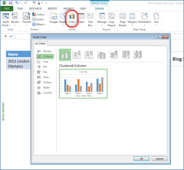
Once the chart is inserted I can select from the field list again. I’m going to stick with the defaults this time, which are ‘Actual Work’, ‘Remaining Work’, and ‘Work’, but I am going to change the ‘Outline Level’ to show ‘Level 2’. The chart will update accordingly. 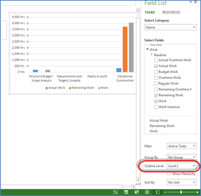
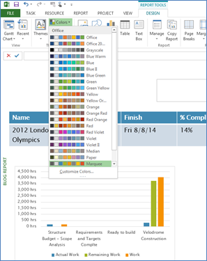
Once you’re done adding various charts and tables you can then apply things such as color schemes, themes and other formatting options to change.
You can also add images to your report by clicking ‘Images’ in the ‘Insert’ section of the ‘Design’ ribbon. I have inserted our EPMA logo which I stored on my Desktop and changed the formatting for my title text box.
With a combination of these various elements it is very simple to create a professional looking report to display any information that you require. You can also Export your reports to other Office applications such as Word, Outlook, Excel, etc. To do this, you just click on the ‘Copy Report’ button within the ‘Design’ Ribbon. This will copy the report to your clipboard. You can then paste it into other Office applications.
Please feel free to leave your comments.
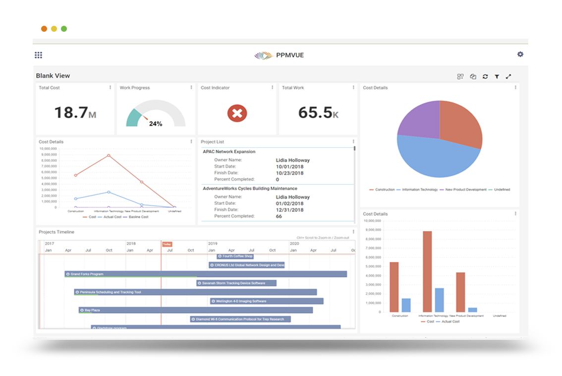
GAIN VISIBILITY WITH PPMVUE
Bring your Project Online data to life with PPMVUE.
Create dashboards and reports for Portfolios, Projects and more in few clicks. Ready to use out of the box and works with any configuration
Download From Office Store Learn More