One of the common complaints I hear with Project Pro 2013 is that once you make a change in the schedule the resulting effects are hard to see. Let’s start with why this is important and then look at how you can customize the highlighting to your liking.
Microsoft Project is a scheduling tool and one of the things you would want to see is the repercussions on the changes you make; it could be for analysis purposes or to convey the new dates to your stakeholders. Either way, it’s important to see the changes and how the rest of your plan is flowing. In Project Pro 2013, the cells that change are highlighted in a fairly light color and I have had several people ask if there was a way to change the color of the highlighted cell. The answer is Yes! Today you will learn how to do that and perhaps show off this feature to your colleagues.
Here is our example schedule:
Out-of-the-box the highlighted cells are a light blue shade and depending on your monitor, your screen tilt etc. it can be hard to see. To change this, go to the ‘Format’ Ribbon and in the ‘Format’ section, click on ‘Text Styles’.

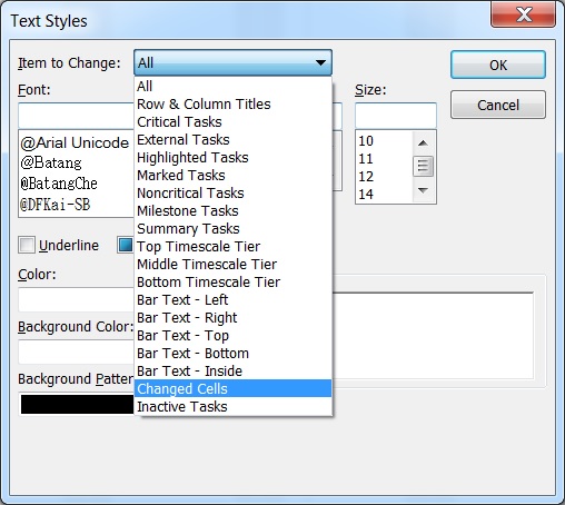
Now, in the ‘Text Styles’ dialog box, click on the ‘Item to Change’ dropdown and select ‘Changed Cells’

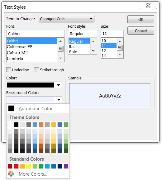
In the ‘Color’ section, click on the ‘Background Color’ dropdown and select a color you’d like (I picked orange) and click ‘OK’

As an example, I’ll increase the duration for Task A to see the new changes highlighted.
Now that the changes can be clearly seen, you’ll be able to focus on your schedule and communicate it to your team instead of being frustrated with little things.
Hope this was helpful to you!
Feel free to let me know your thoughts in the comments below or email me at [email protected]

